BRICK BY BRICK – An Educational Practice in Editorial Design
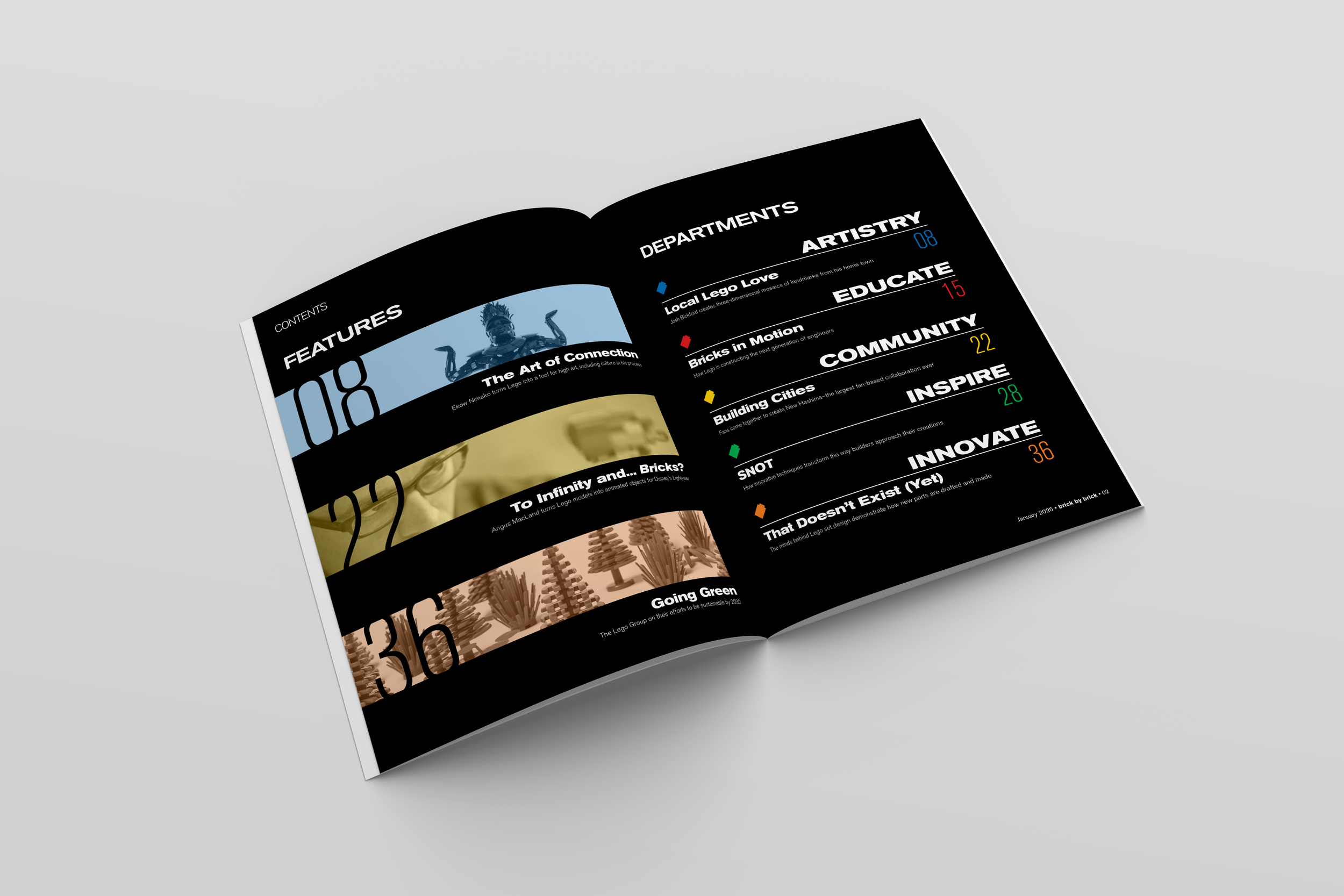
This publication reimagines Lego as a medium for art, design, innovation, and education, moving beyond the typical focus on set releases and child-centric content. Designed for Adult Fans of Lego (AFOLs), professionals in engineering and robotics, artists, and educators, it highlights the creative and technical potential of Lego in unexpected ways. Features explore master builders, advanced construction techniques, and the intersection of Lego with fields like architecture and technology. A balance of professionalism and playfulness ensures content remains both informative and inspiring. Through high-quality visuals and engaging storytelling, the publication celebrates Lego as more than a toy–an essential tool for creativity and exploration.
THE PITCH:
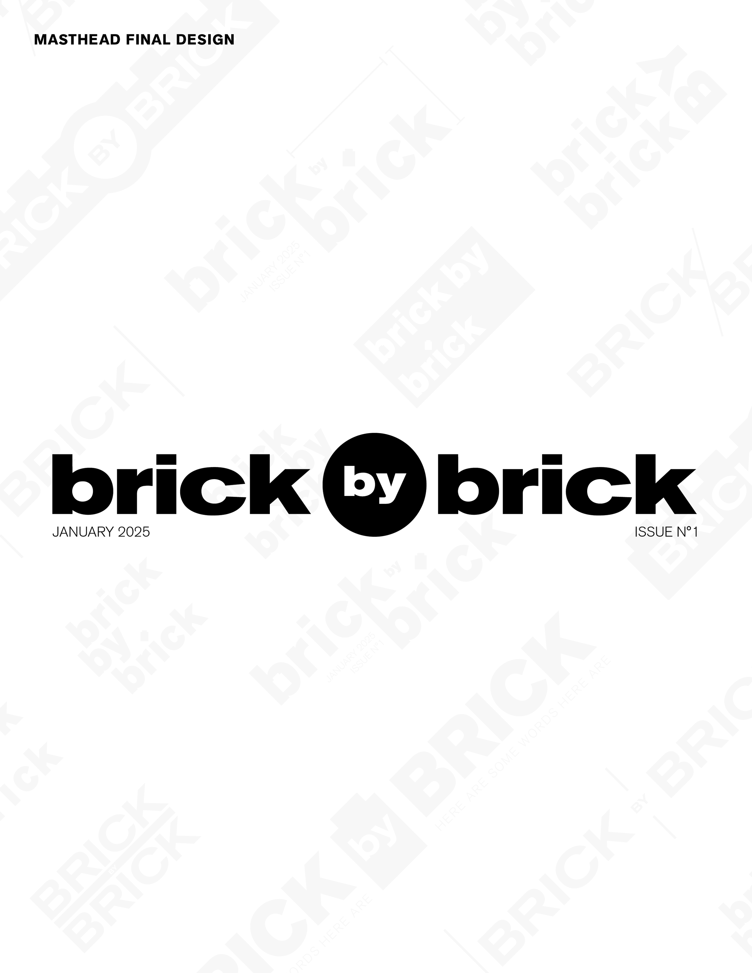
THE MASTHEAD
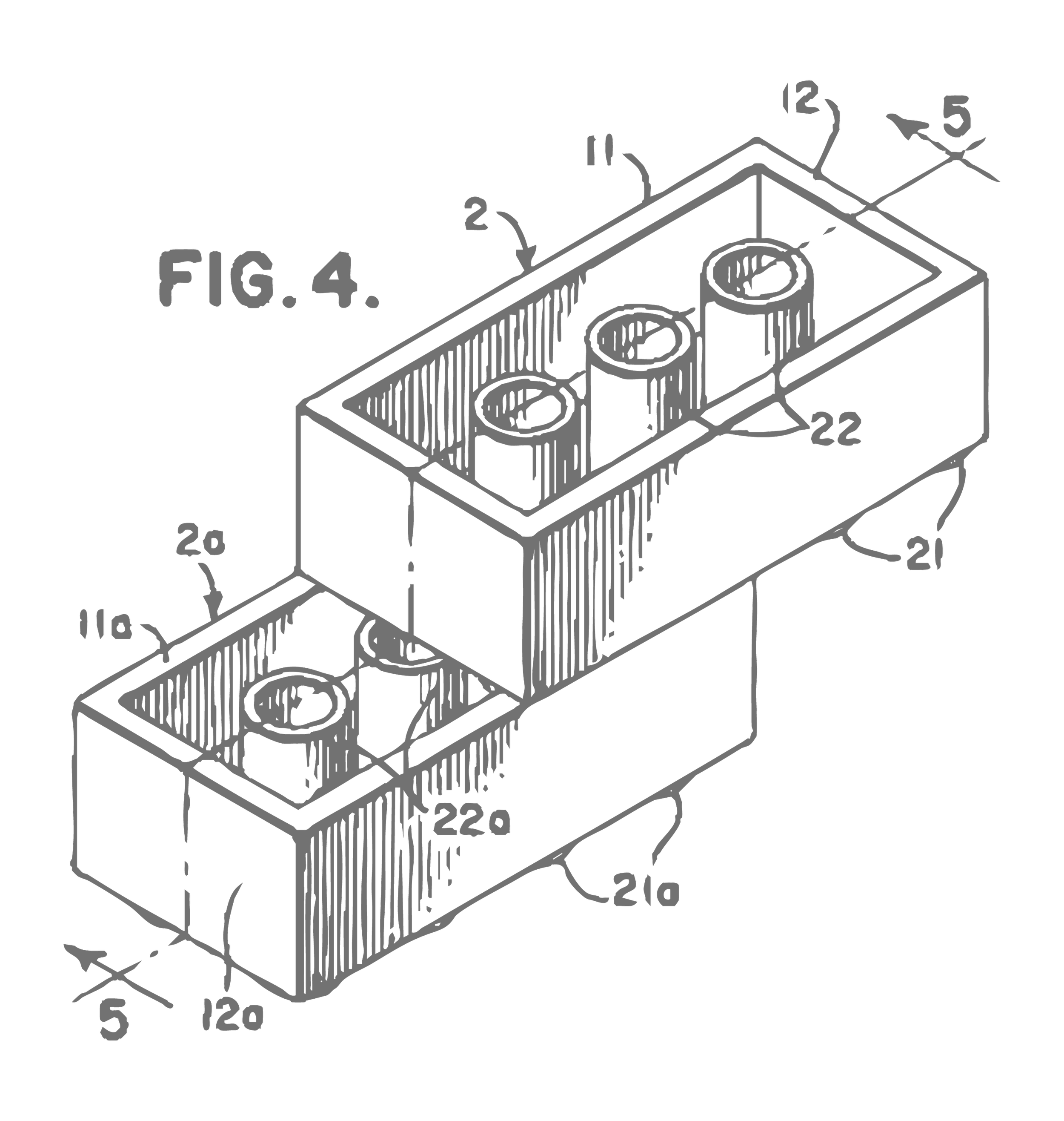
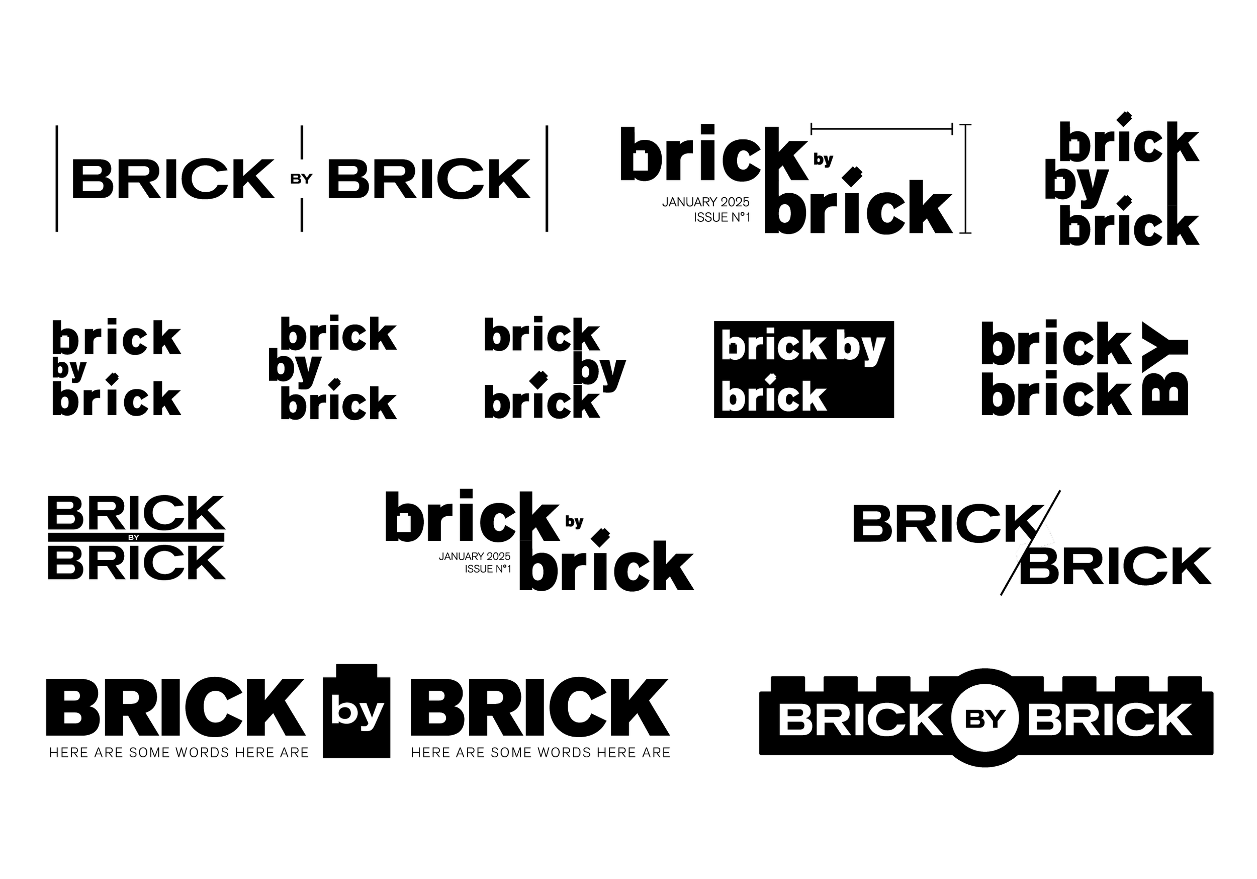
The Brick by Brick masthead developed through iterative typographic studies focused on construction as a visual behavior, not just a metaphor. I treated letterforms as modular pieces–stacking, offsetting, and repeating them until the title felt assembled rather than designed. Alongside this, I referenced the shaping logic of LEGO elements, using their snap, alignment, and incremental geometry to guide proportion and spacing decisions in early samples.
Many variations also relied heavily on negative space, allowing gaps and absences to carry meaning as much as the forms themselves–suggesting growth, incompletion, and the idea that something is always in the process of becoming. The final masthead balances structure and openness: a system that feels methodical, but still human, reinforcing the publication’s theme of building identity piece by piece.
Interestingly, there were a few directions I personally felt communicated the concept more clearly to an audience already familiar with the subject matter. Ultimately, I chose to trust my professor’s design instincts and allowed him to select the final mark–a perspective rooted in strong graphic design experience, even if less tied to the niche context of the publication. It leaves open the question of whether an “insider” audience might gravitate toward a different solution, and that internal tension became part of the learning process itself.
COVERS
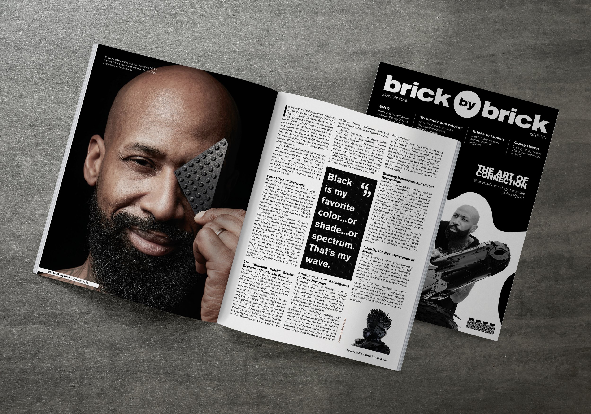
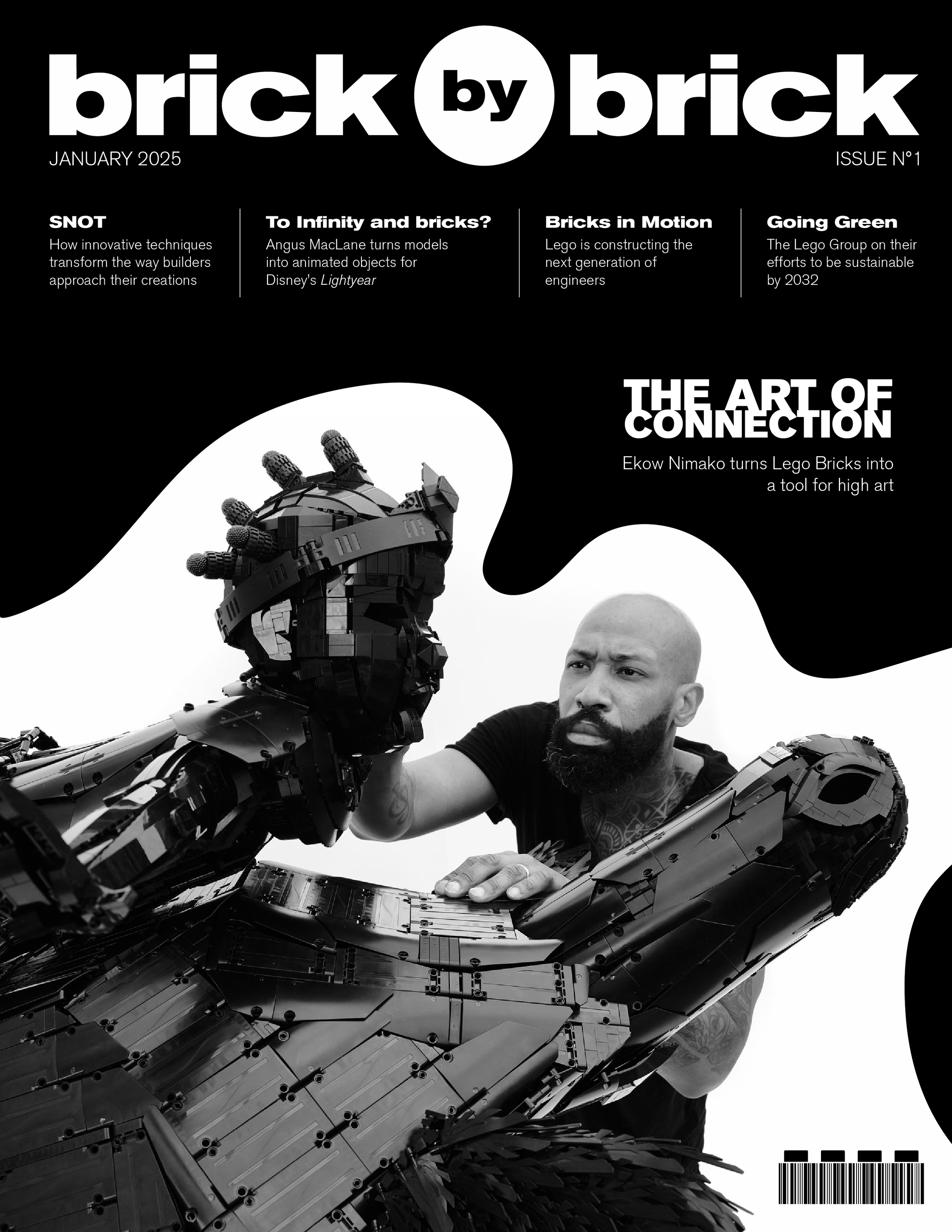
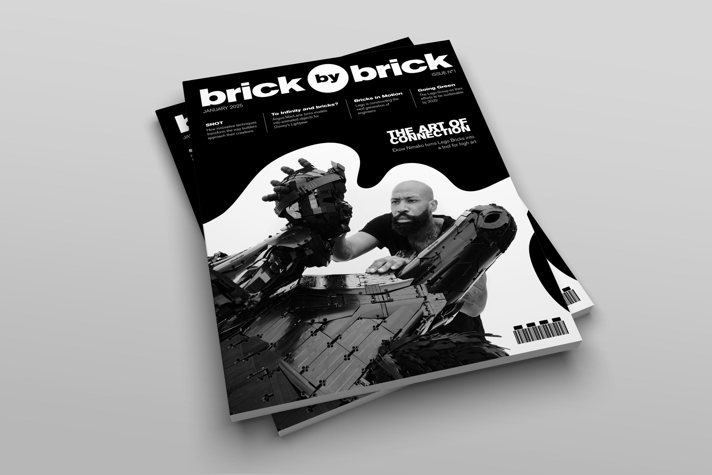
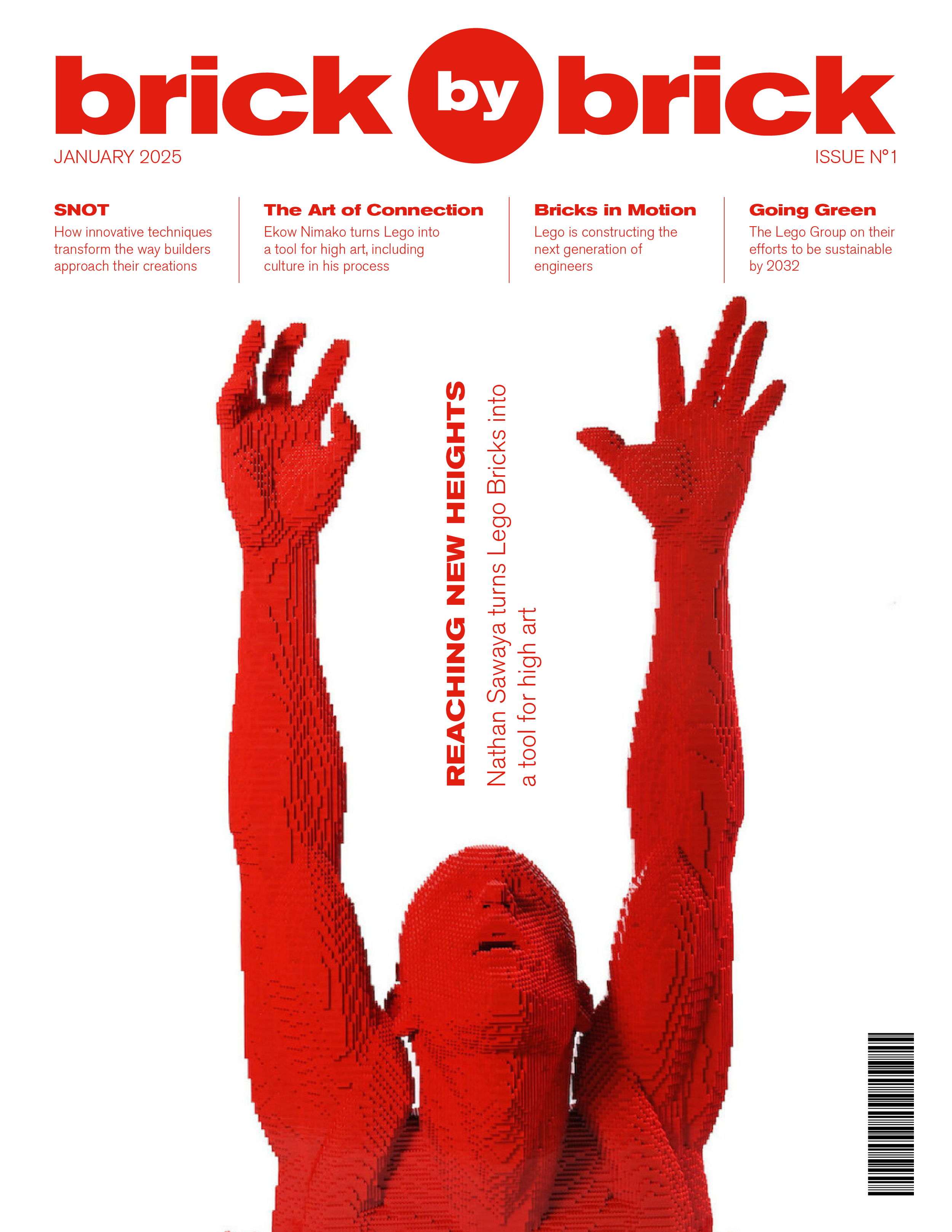
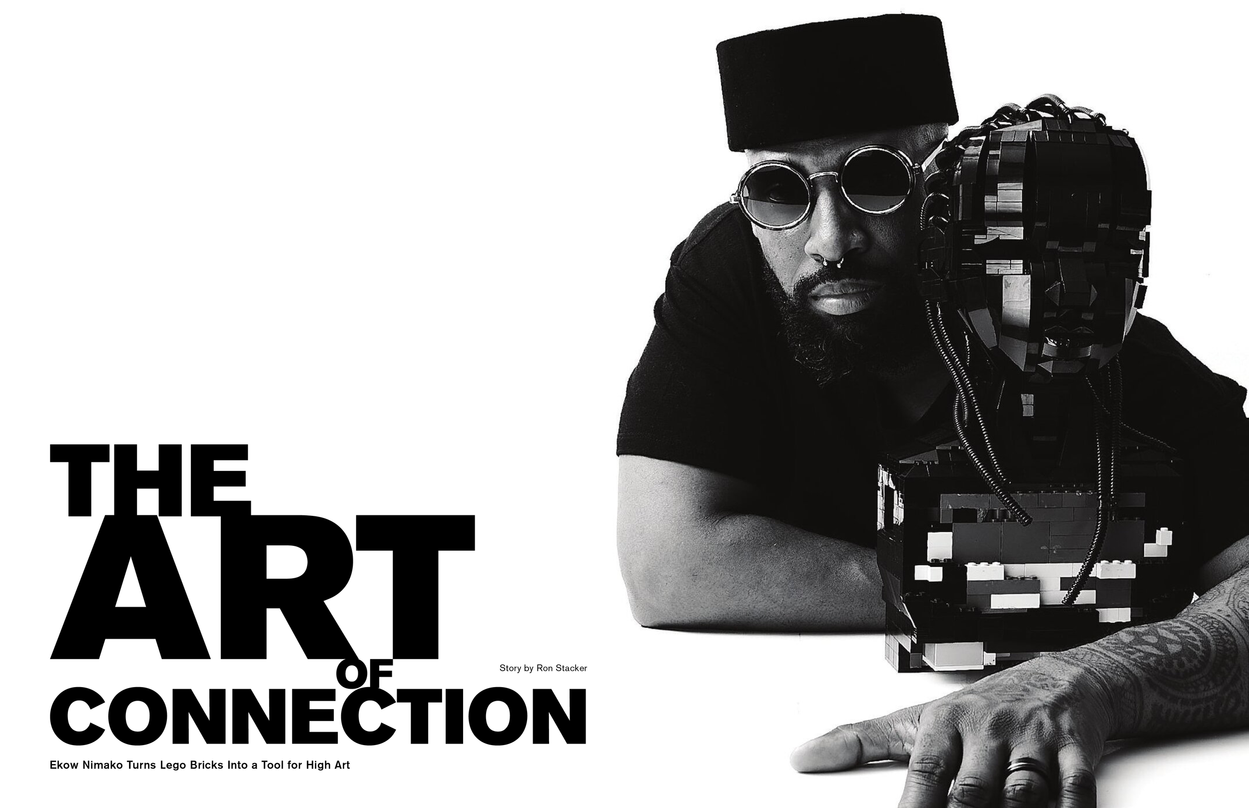
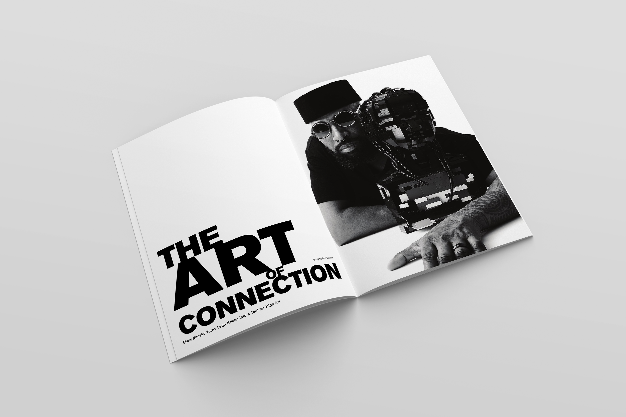
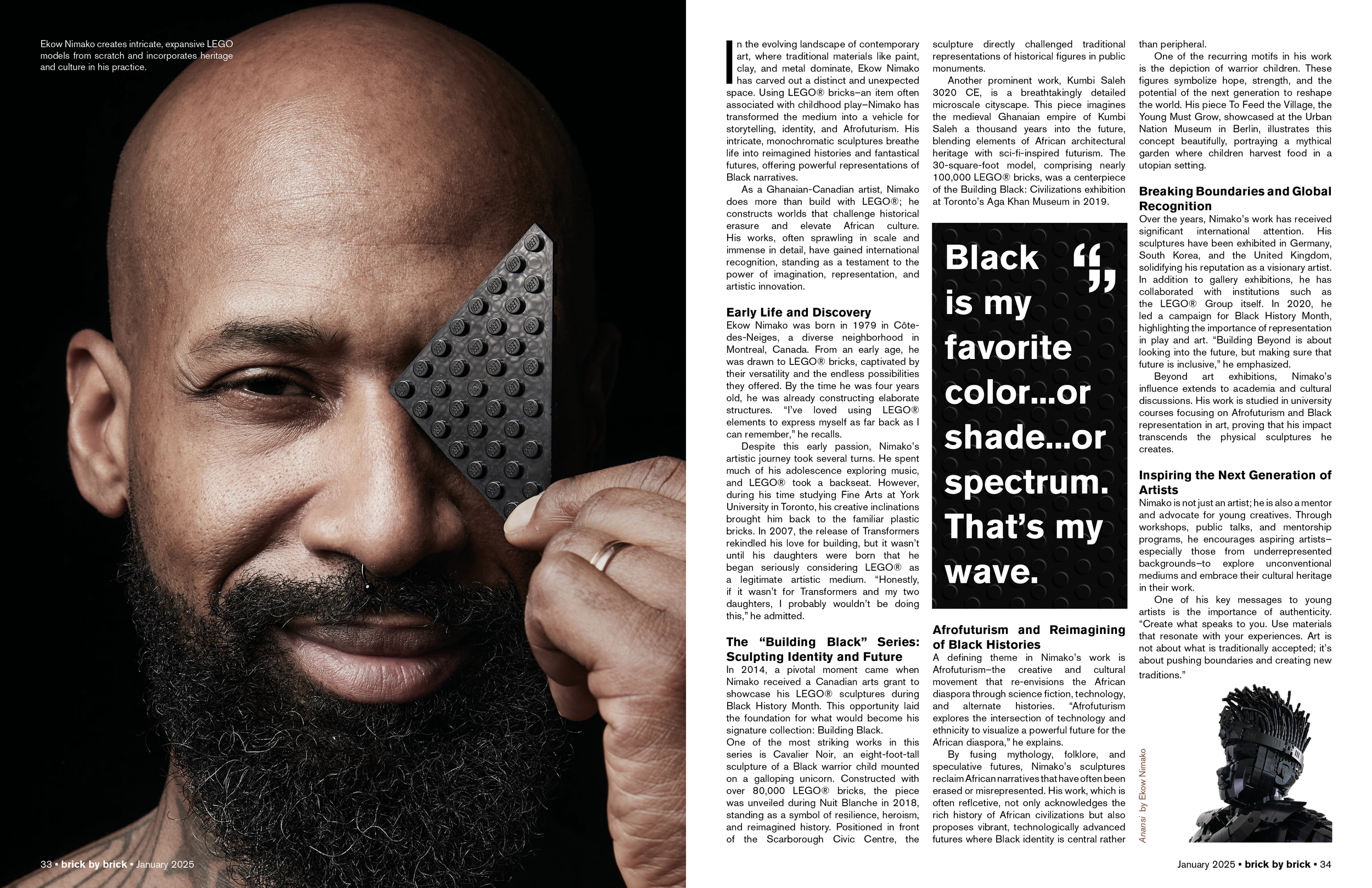
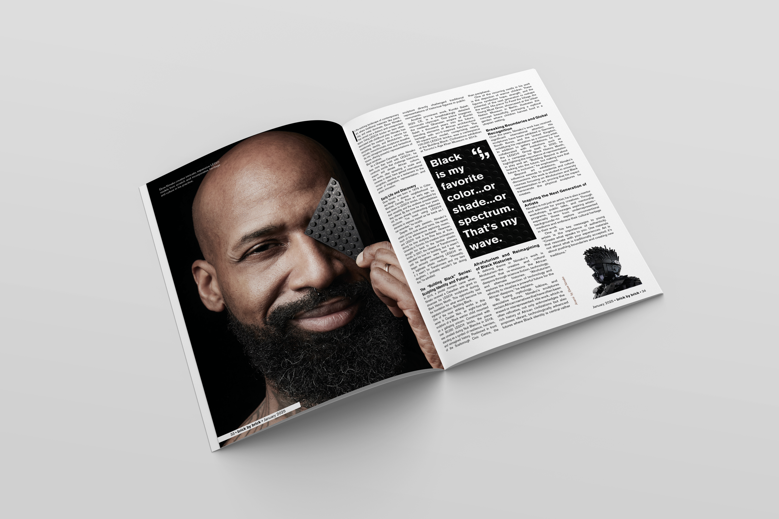
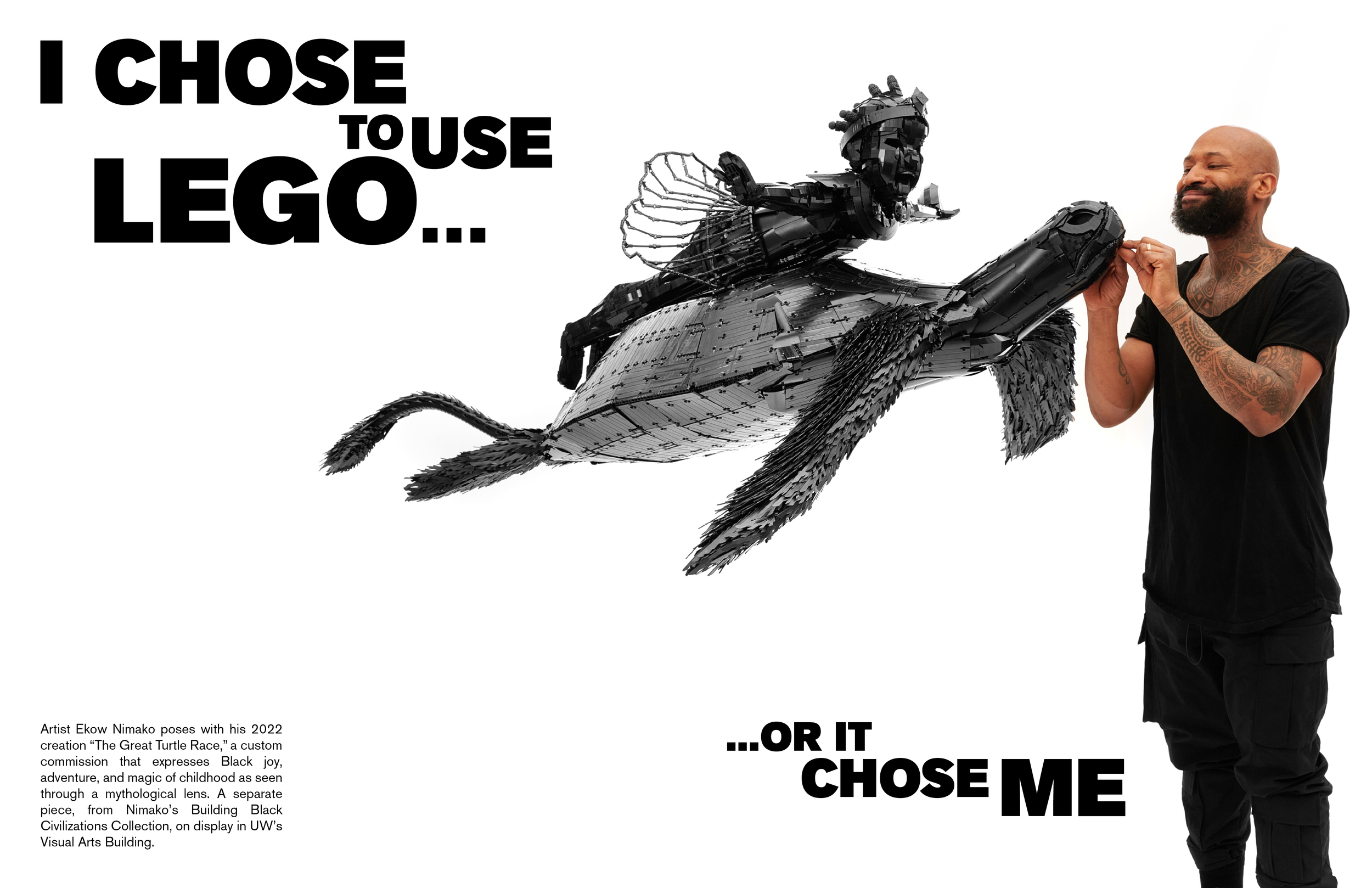
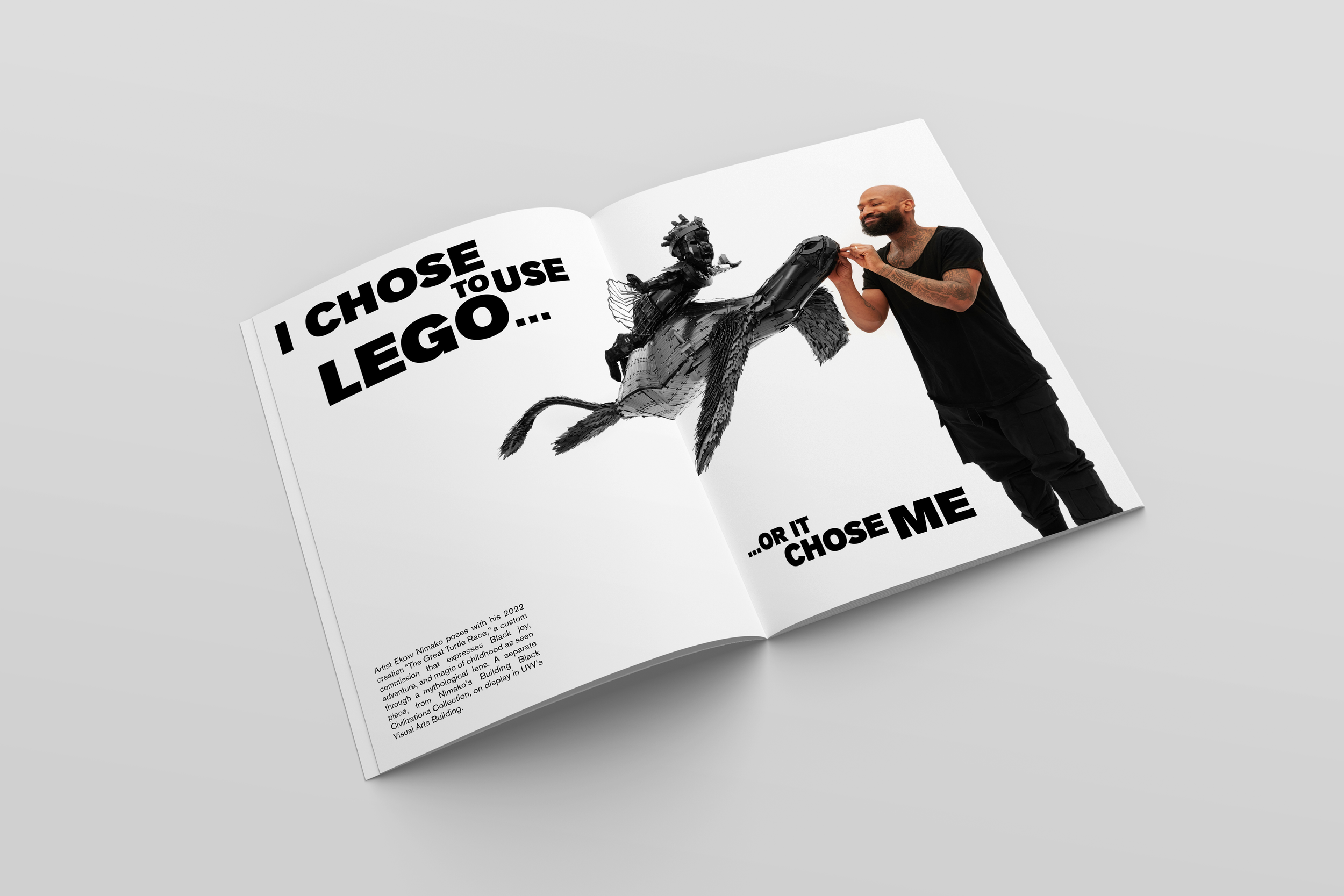
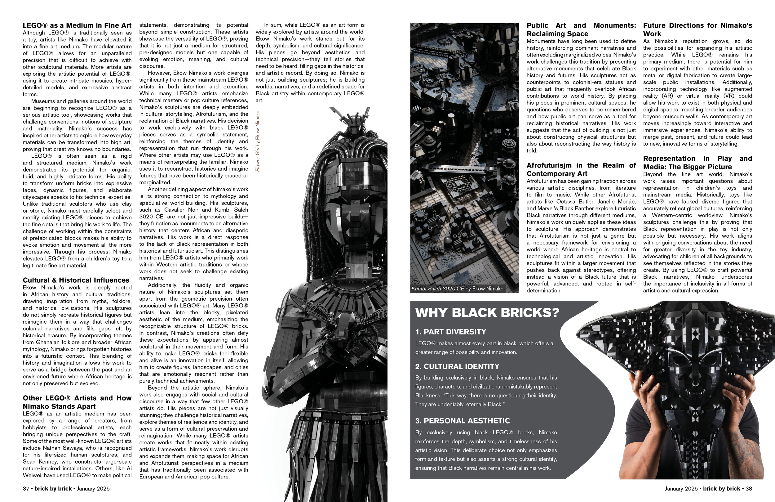
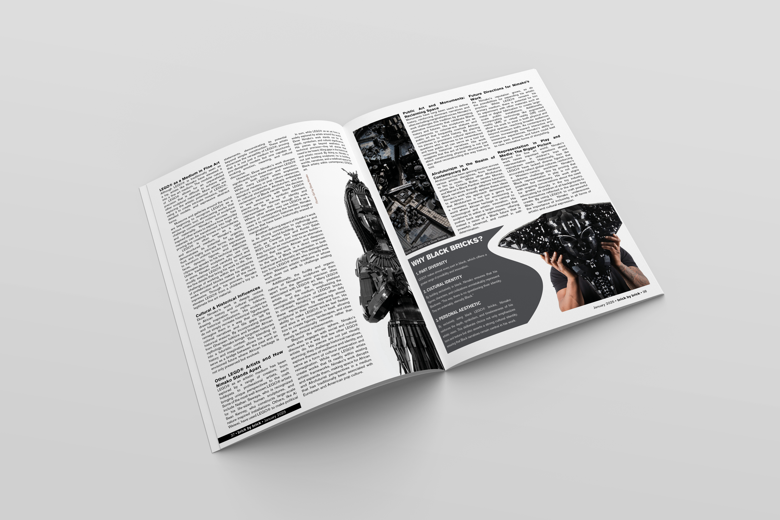
The cover concepts were grounded in real stories and interests from within the LEGO fan and professional building community–from SNOT building techniques to artists and creators like Angus McLane and Nathan Sawaya. As I researched, I found myself most drawn to artist Ekow Nimako’s practice, particularly his material restraint and sculptural approach to form.
Because of that connection, his work became the foundation for the feature and ultimately the cover: imagery highlighting his process paired with restrained, complementary graphics that let the craftsmanship lead. The final cover reflects not just the publication’s subject, but the perspective I developed while studying the community it represents–prioritizing authenticity over spectacle.
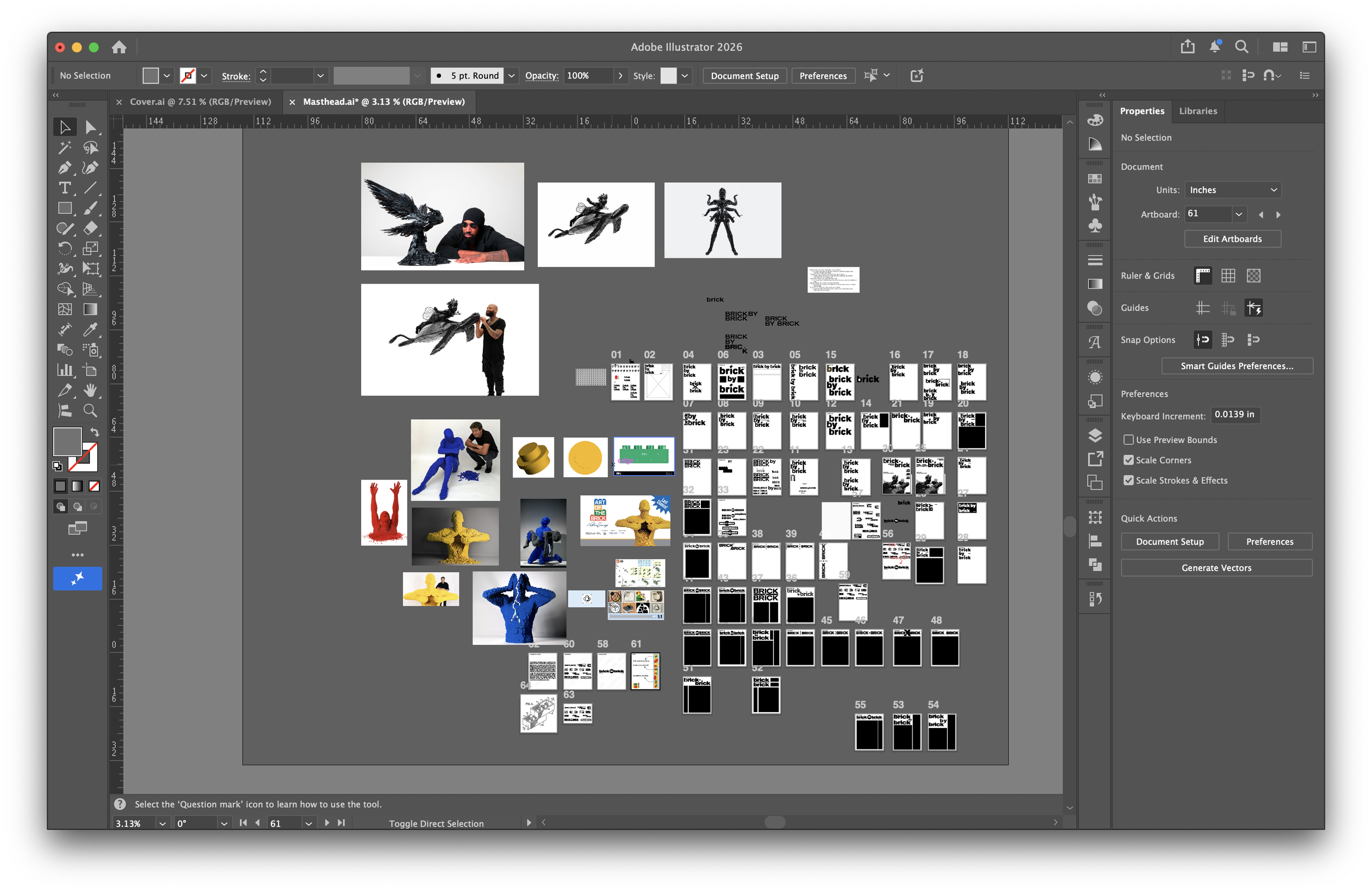
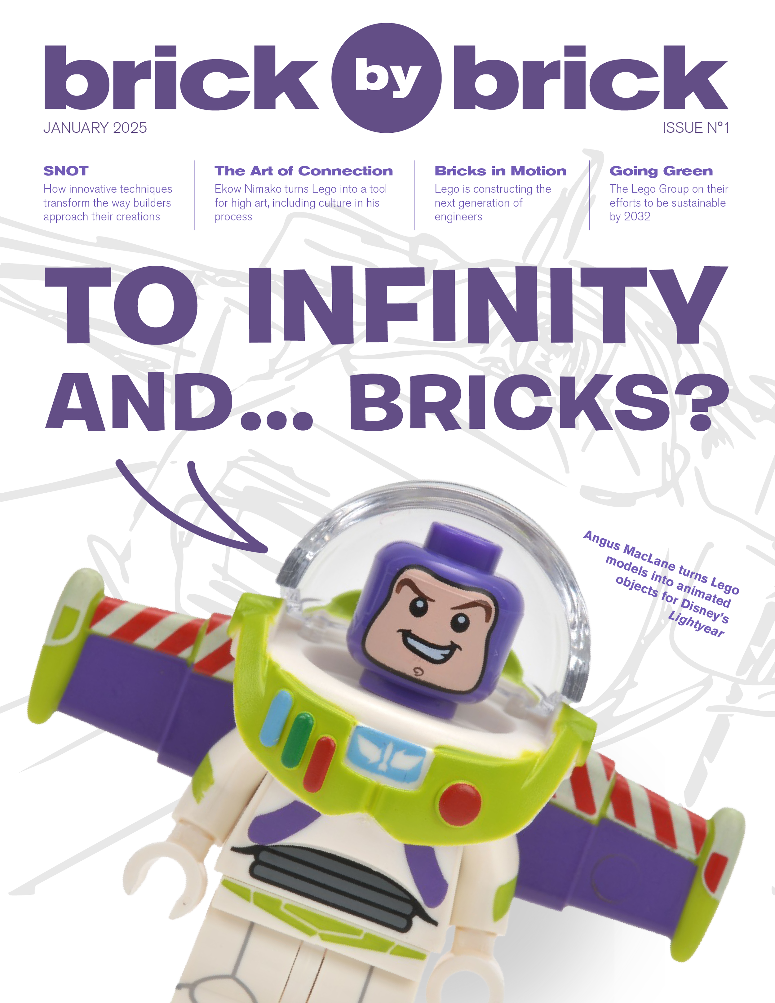
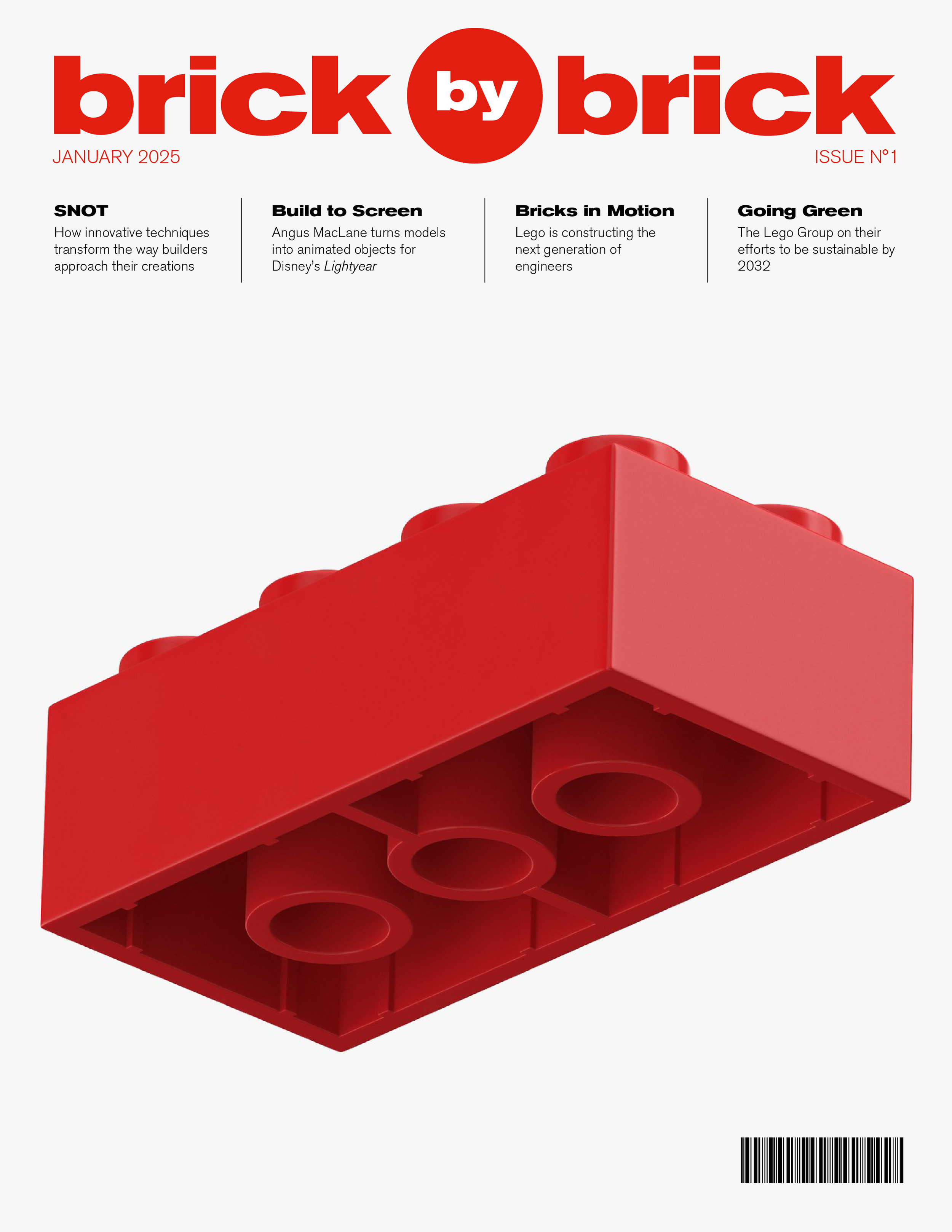
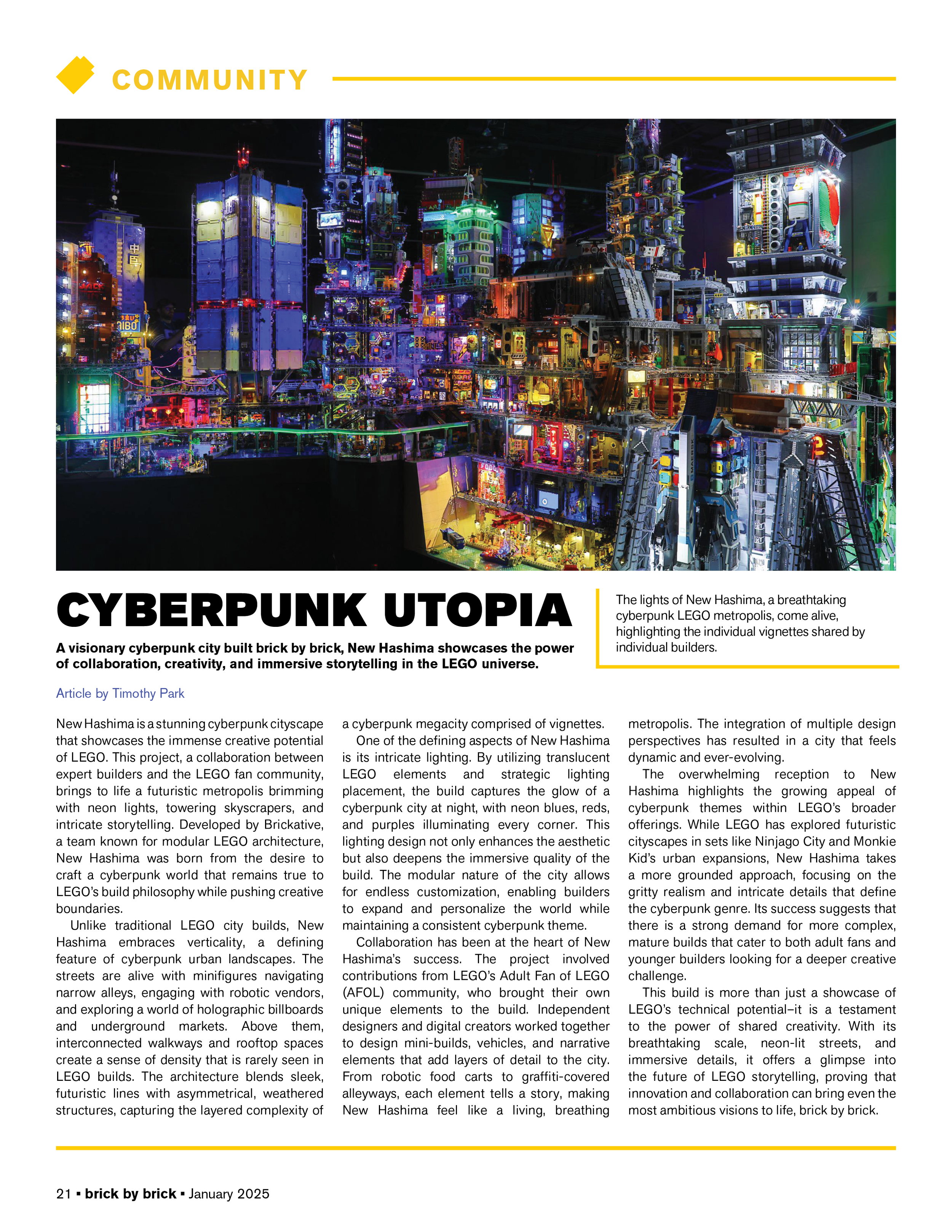
A creative practice isn’t complete without room for divergence, so I continued developing alternate covers beyond the final direction. Using the same real-world subjects and conversations within the LEGO community as a foundation, I experimented with different visual voices, hierarchies, and tones to see how the story could shift depending on presentation. These variations became a way to test perspective–not replacing the chosen solution, but strengthening it by understanding what it wasn’t and what it could be.
The other samples, shown here, needed to function as complete ideas, not just fragments, so they could genuinely guide my direction rather than decorate it.
FEATURE
ARTICLE
ADDITIONAL WORK
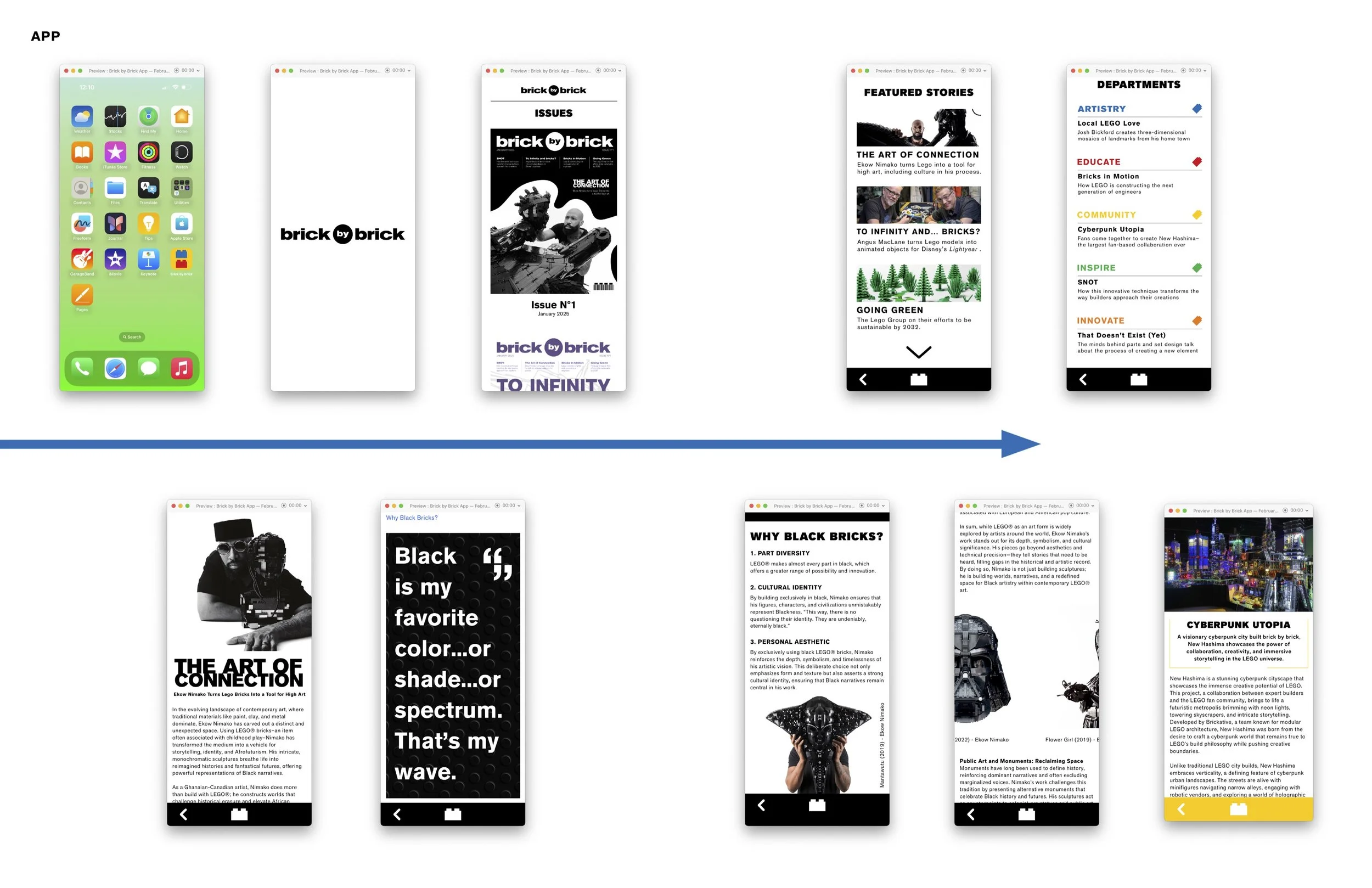
Application created in Adobe XD

