SnoPlanks (Chief Marketing Officer, 2024-2025)
A BRIEF HISTORY
SnoPlanks began as an independent snowboard brand and later transitioned into a student-run company at Oregon State University-Cascades after the founder entrusted the brand to the program as an educational platform. The company shifted from a traditional owner-operated structure to a rotating team of students responsible for design, marketing, and production decisions, meaning the brand now had to function both as a real product and a teaching tool. That change introduced a rare challenge: maintaining the recognition and trust of an existing community while operating within academic timelines, cohort turnover, and collaborative decision-making. The brand already had a voice–established through years of rider familiarity and prior releases–and the task was to learn its patterns, priorities, and visual habits before attempting to extend them into a new chapter shaped by many contributors rather than two owners.
Founder James Nicol
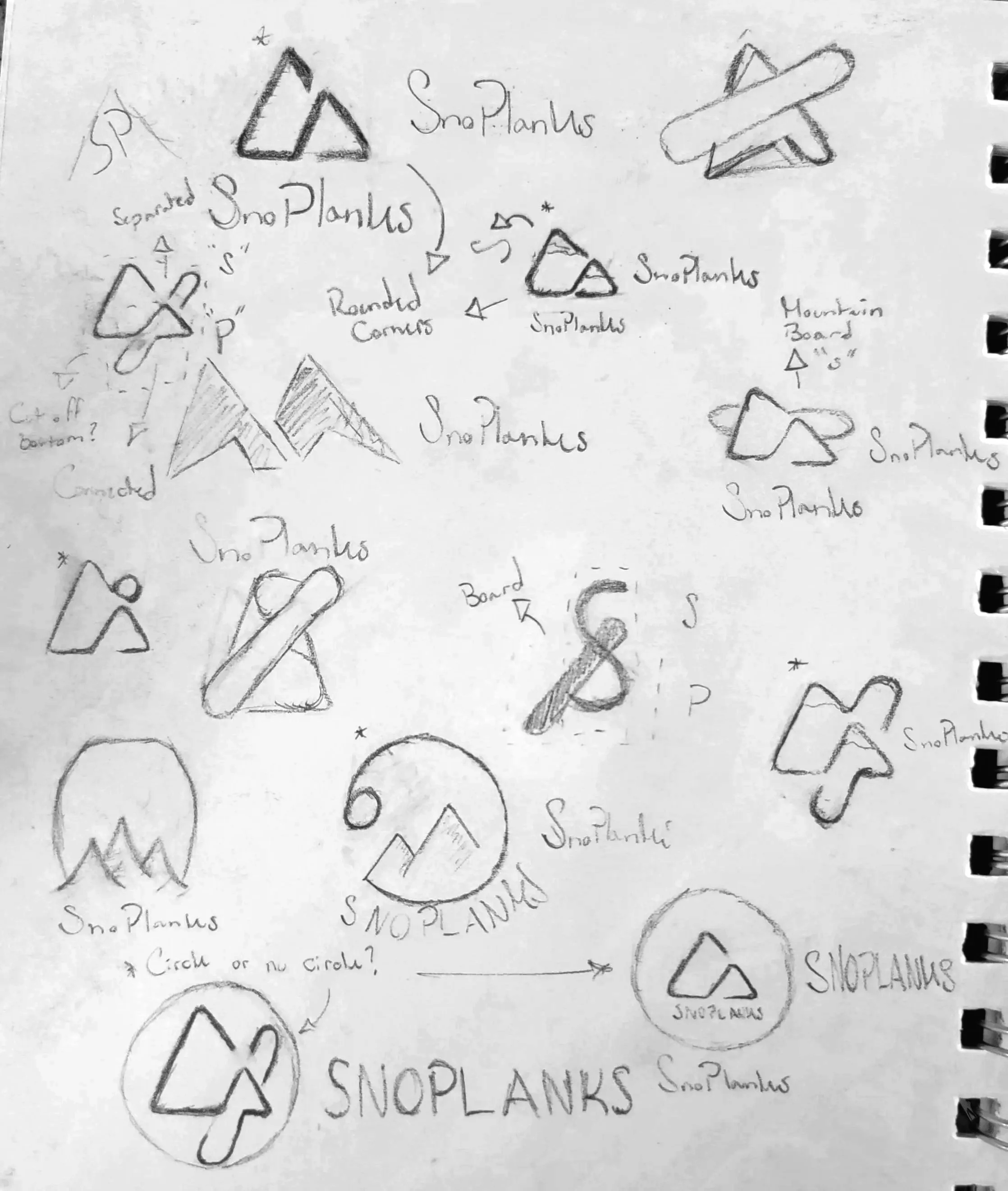
Rather than redesigning SnoPlanks from the ground up, I approached it as stewardship. The goal was to introduce new visual language without separating the brand from its past. I worked to create imagery that felt considered and contemporary while still belonging to the company's lineage. This meant identifying what elements were essential to recognition and allowing them to anchor newer ideas. The intention was gradual evolution–changes noticeable over time rather than all at once.
CARRYING THE IDENTITY
FORWARD
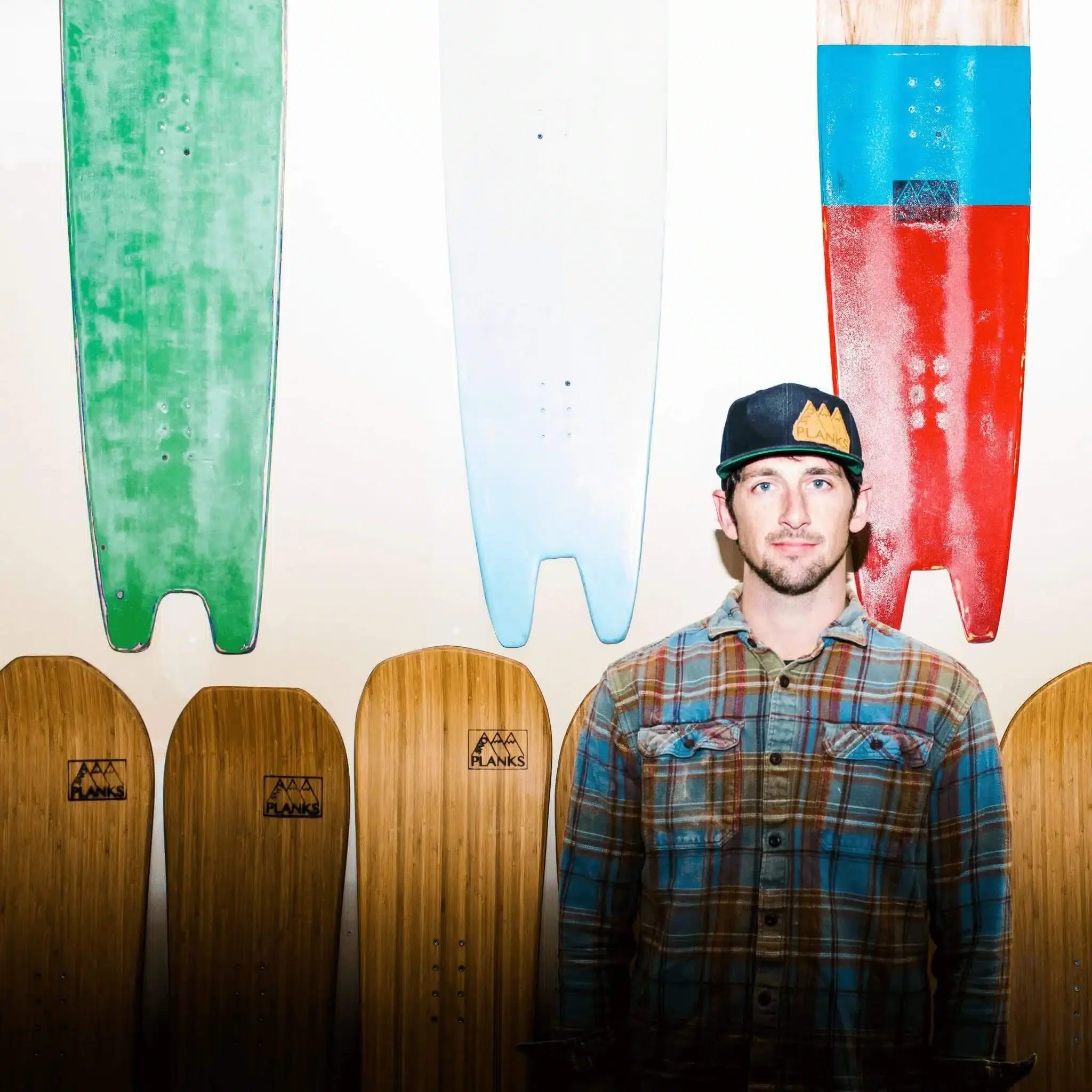
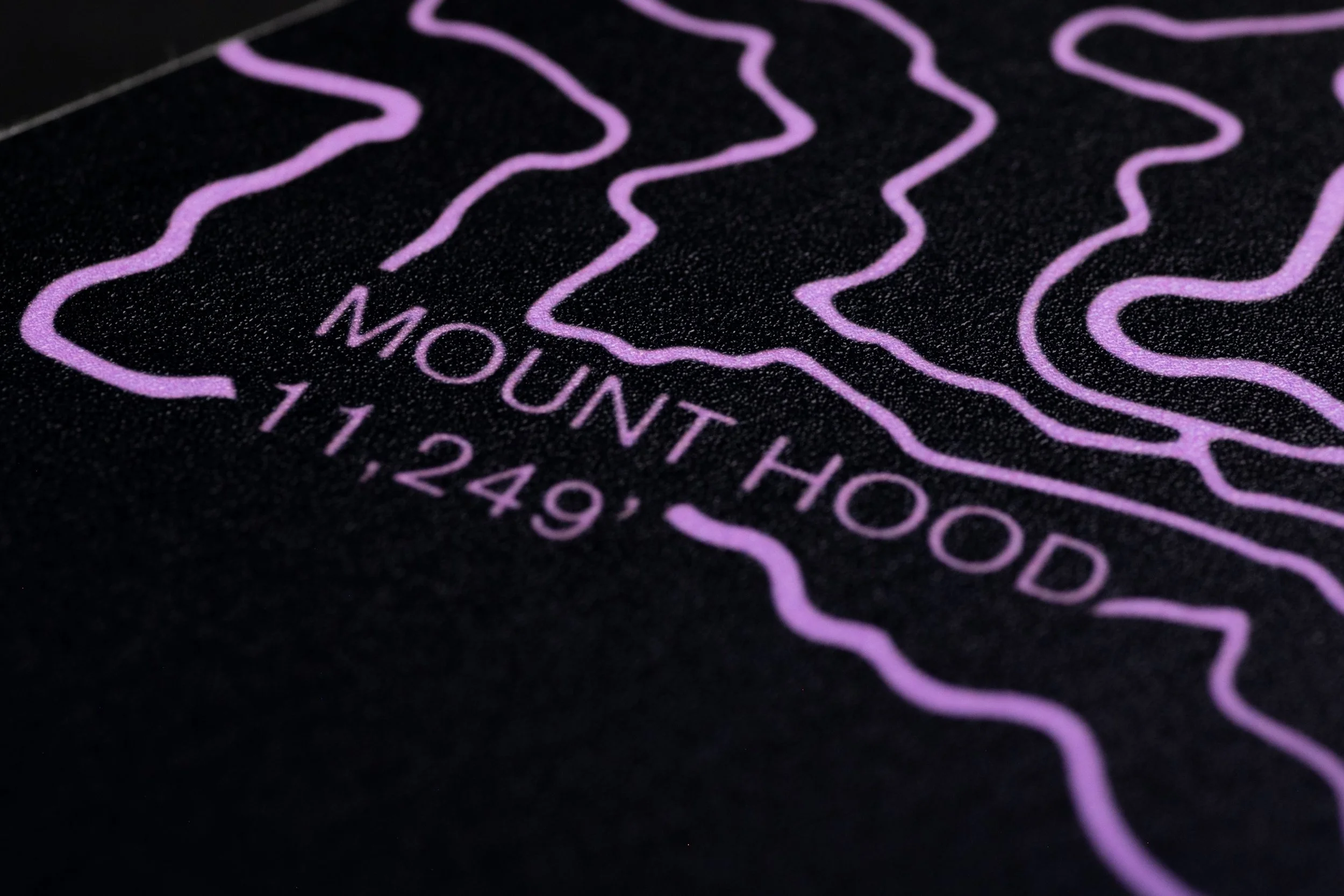
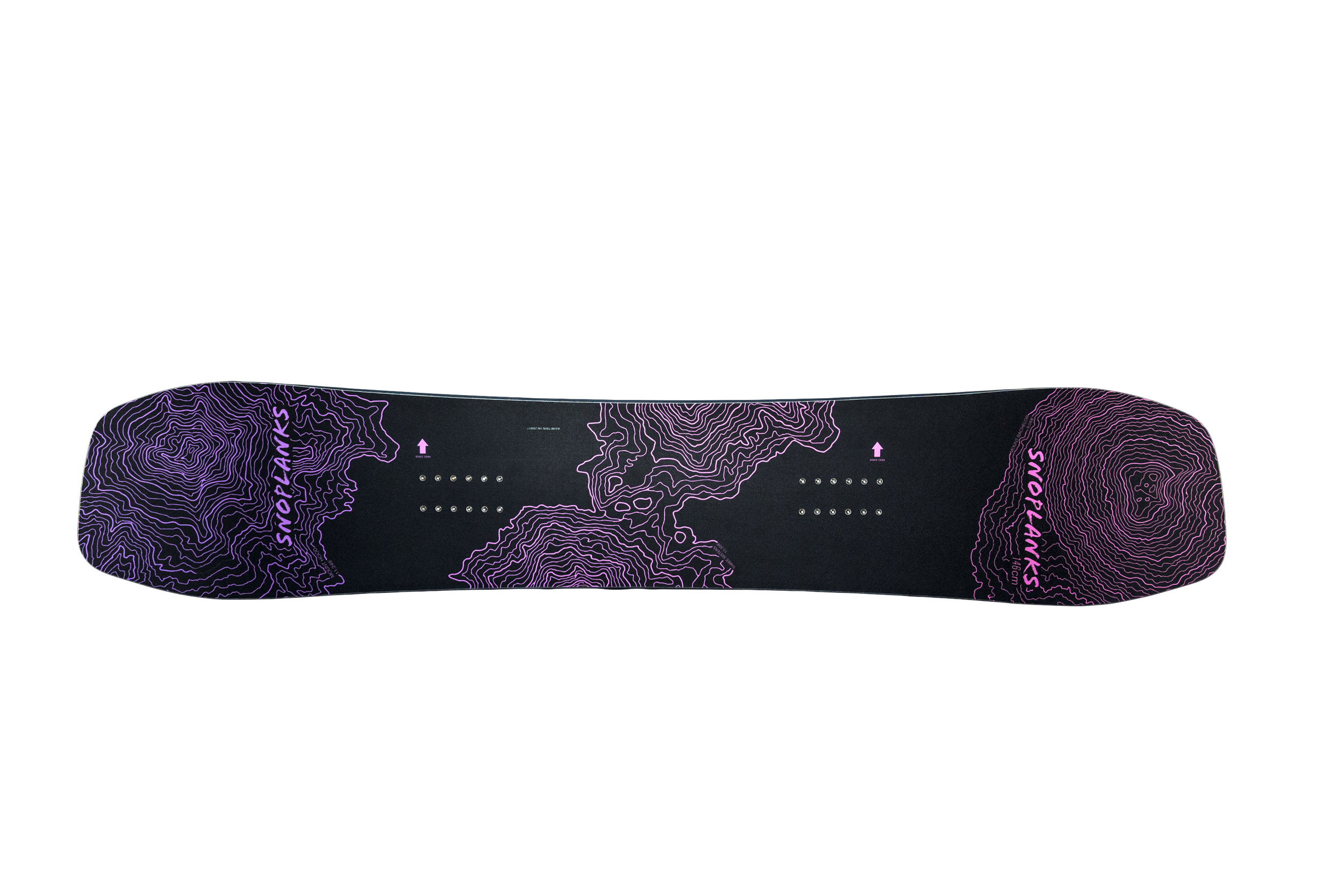
The season centered around two primary snowboard graphics, one of which I designed with a peer and one I assisted in the development of. The board acted as the visual anchor, with attention given to composition and how the artwork would exist both as a physical object and as a photographed subject, allowing it to guide the tone of surrounding materials without becoming repetitive.
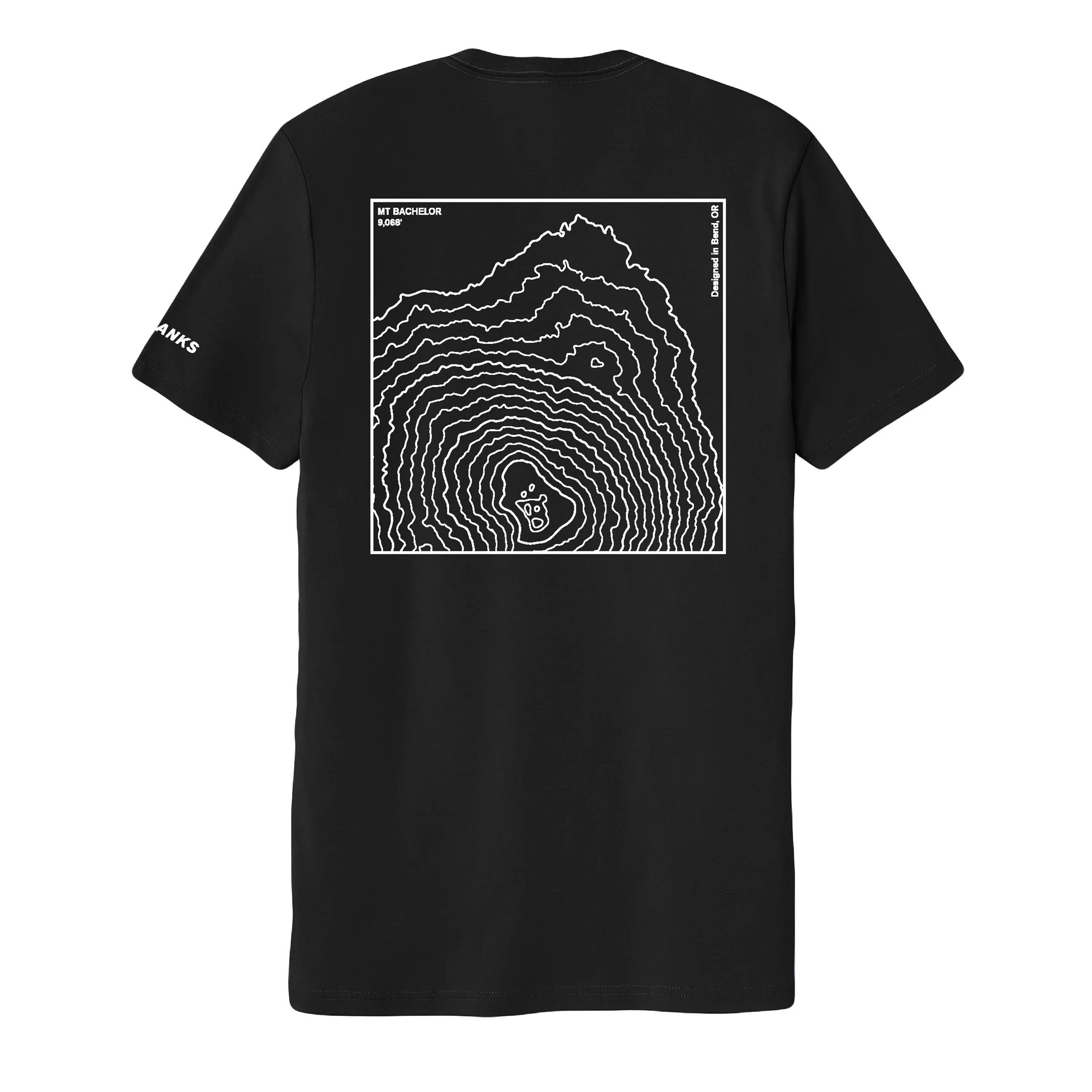
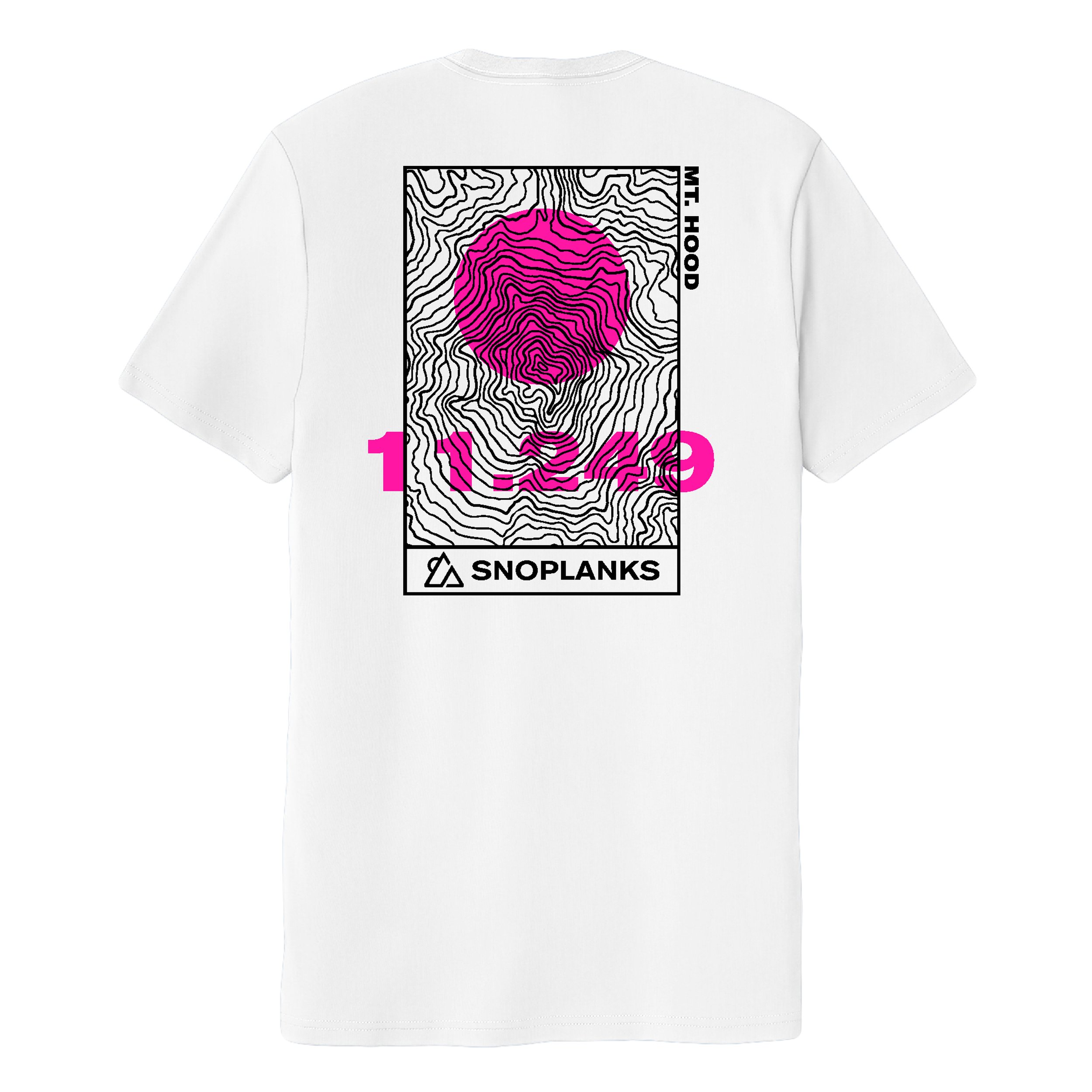
From there, supporting materials translated the design into communication. Spec sheets clarified construction and technology through structured layouts, while a lookbook presented the products within a visual narrative rather than a simple catalog. Apparel extended the artwork into everyday use, allowing the brand to exist off the mountain while maintaining continuity across mediums.
DIRECTION, DESIGN,
AND PRODUCT COMMUNICATION
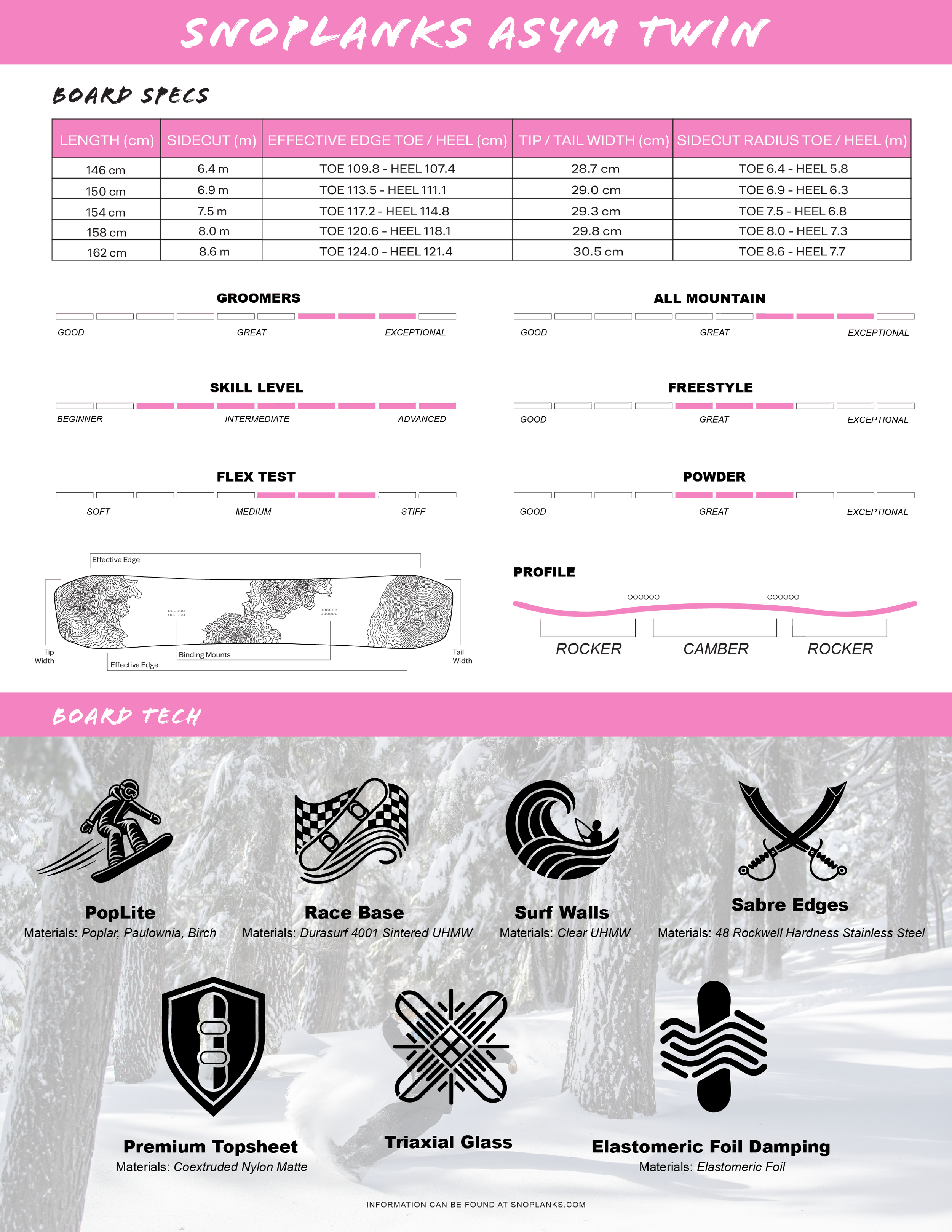
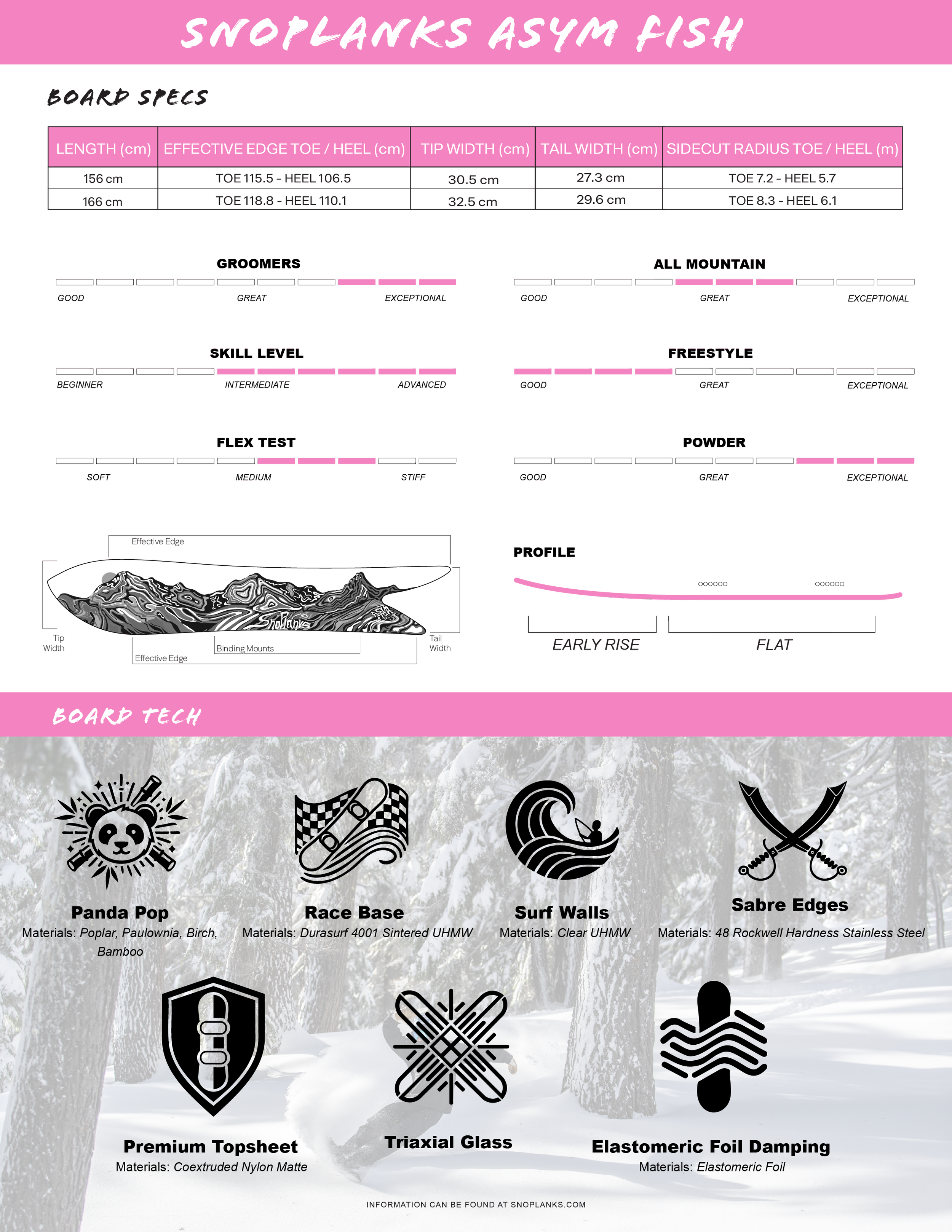
SPEC SHEET WORK FLOW
Met with the product team to determine which board characteristics and construction details were most important to communicate
Structured the hierarchy of information (specs, performance ratings, profile, materials) for quick scanning in a retail setting
Designed a consistent layout system that could scale across multiple board models and future seasons
Created custom iconography and graphics for board technologies
Standardized measurement tables (lengths, widths, radii, effective edge) for clarity and comparison
Developed visual rating bars for terrain, skill level, flex, and riding style
Prepared production-ready files and export formats for print and web distribution
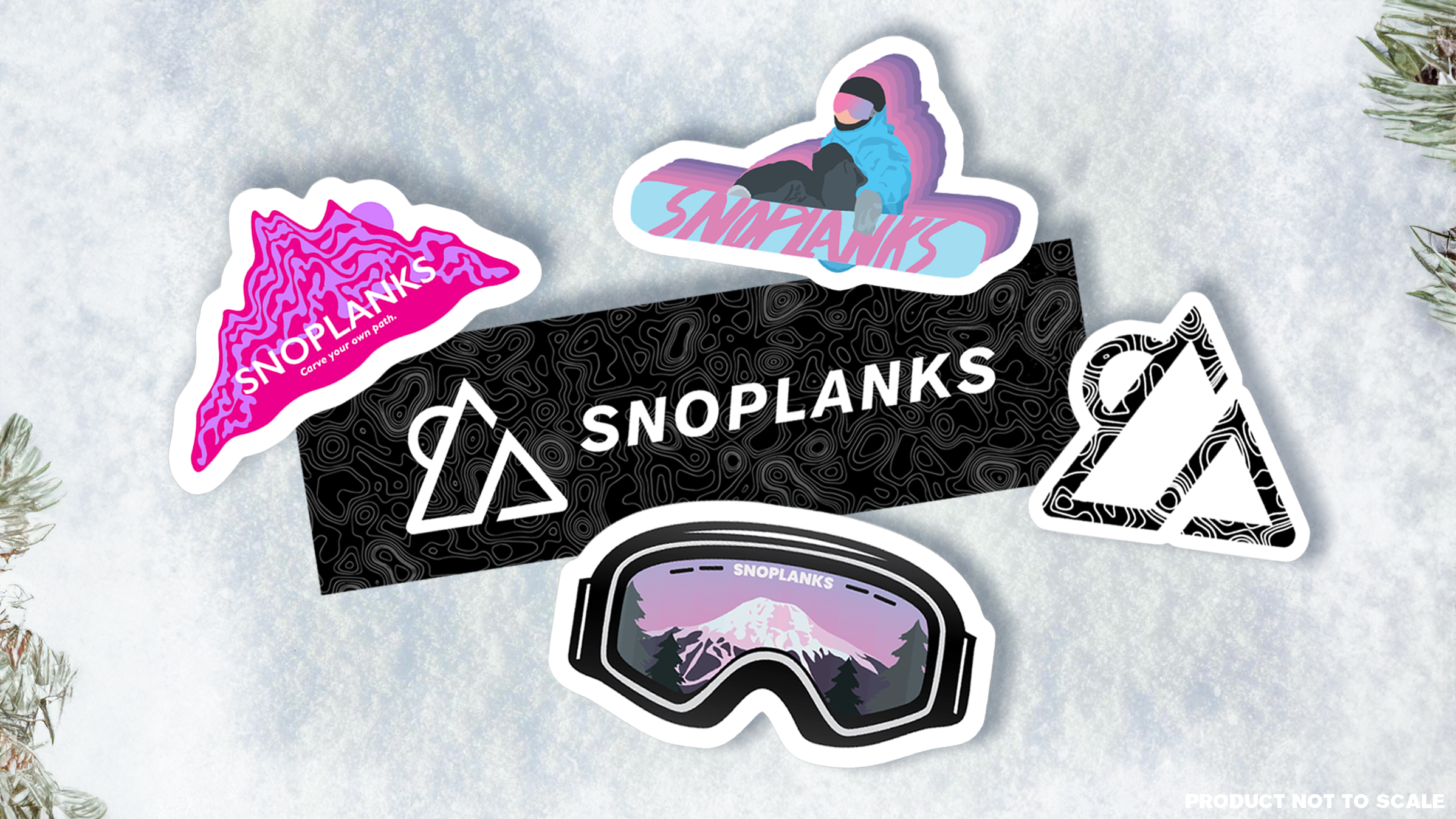
Let’s talk about stickers. Creating this brand-forward merch wasn’t just about producing fun–it was an intentional opportunity to guide my team through the full product lifecycle, from concept to finished asset. This process gave them hands-on experience with design standards, file management, and production considerations that are crucial in any professional design setting.
Concept Development: Translating brand identity into engaging, visually cohesive sticker designs.
Vector Design & Clean Files: Ensuring all artwork was created in scalable vector formats for print, maintaining crisp lines and accurate color.
File Types & Production Prep: Teaching proper export formats (SVG, EPS, PNG) and resolution settings to match production requirements.
Iteration & Feedback: Reviewing mockups and prototypes to refine shapes, colors, and layering for maximum visual impact.
Understanding the Full Pipeline: From initial sketches to production-ready files, the team learned how every stage–design, review, and prepress–affects the final product.
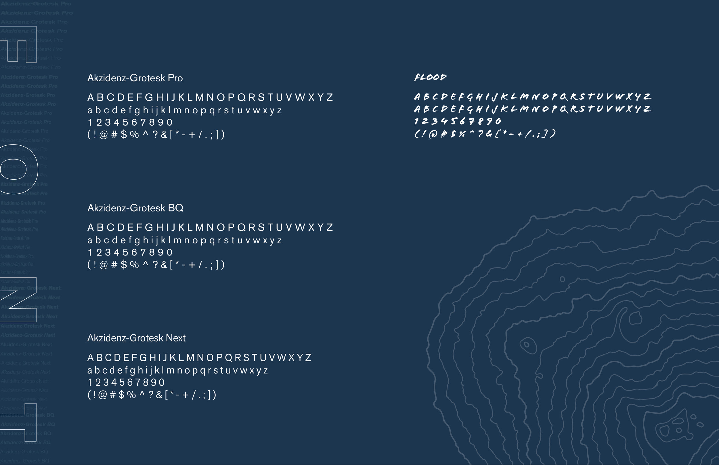
Since SnoPlanks would continue beyond my time there, the work needed to be long-lasting. I helped establish identity guidelines and repeatable templates so future cohorts could contribute without resetting the visual language each year. The intention was not to lock the brand in place, but to give it a foundation strong enough to evolve. As part of this effort, I created a SnoPlanks Brand Visual Guide for future marketing team members. This foundation ensures that the SnoPlanks brand can grow while staying true to the vision we built together.
A SYSTEM FOR THE FUTURE